Chatlytics data visualizations have customizable theme components: the color palette and typography. This guide will help you understand how to create and use your own custom themes!
- Overview
- Pre-Installed Themes
- Designing a Theme - Customization Best Practices
- Building Your Theme
- You've set up your theme! Now what?
Here's whats coming up in this guide:
- We'll go through the 3 pre-installed Chatlytics themes and the thought process behind creating them
- Best practices for your customization
- Guide for implementation of your custom styles
- How to tell Fetch to use your themes
We include three amazing themes as a default, but you may want to create your own. We support that! The process is simple and if you follow best practices for the use of color and typography, you can create some highly customized and effective visualizations.
The three themes already included in Chatlytics are: Blue, Sunrise, and Spring. All of these themes were creating following Samantha Zhang's advice to use colors inspired by nature. Who is Samantha Zhang? Read her article for some great advice.
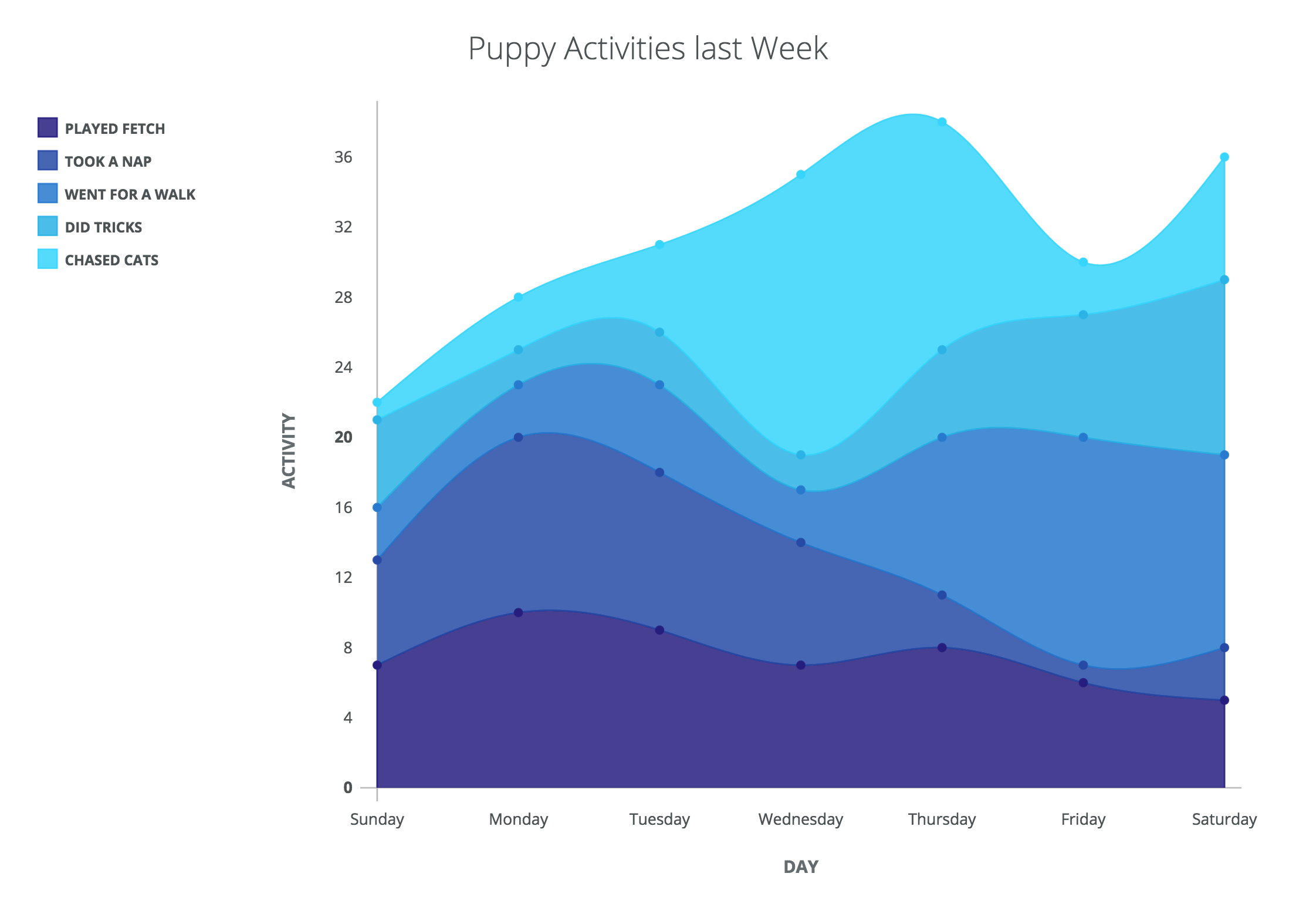
Blue is a commonly loved color so we chose that for a monochromatic palette.
| Nature Image | Palette |
|---|---|
 |
 |
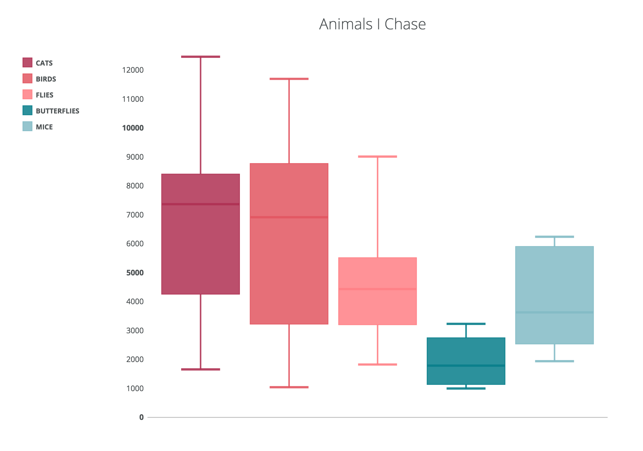
Sunset was created to satisfy something with a little more hue variety and a more sophisticated look because of its dark colors.
| Nature Image | Palette |
|---|---|
 |
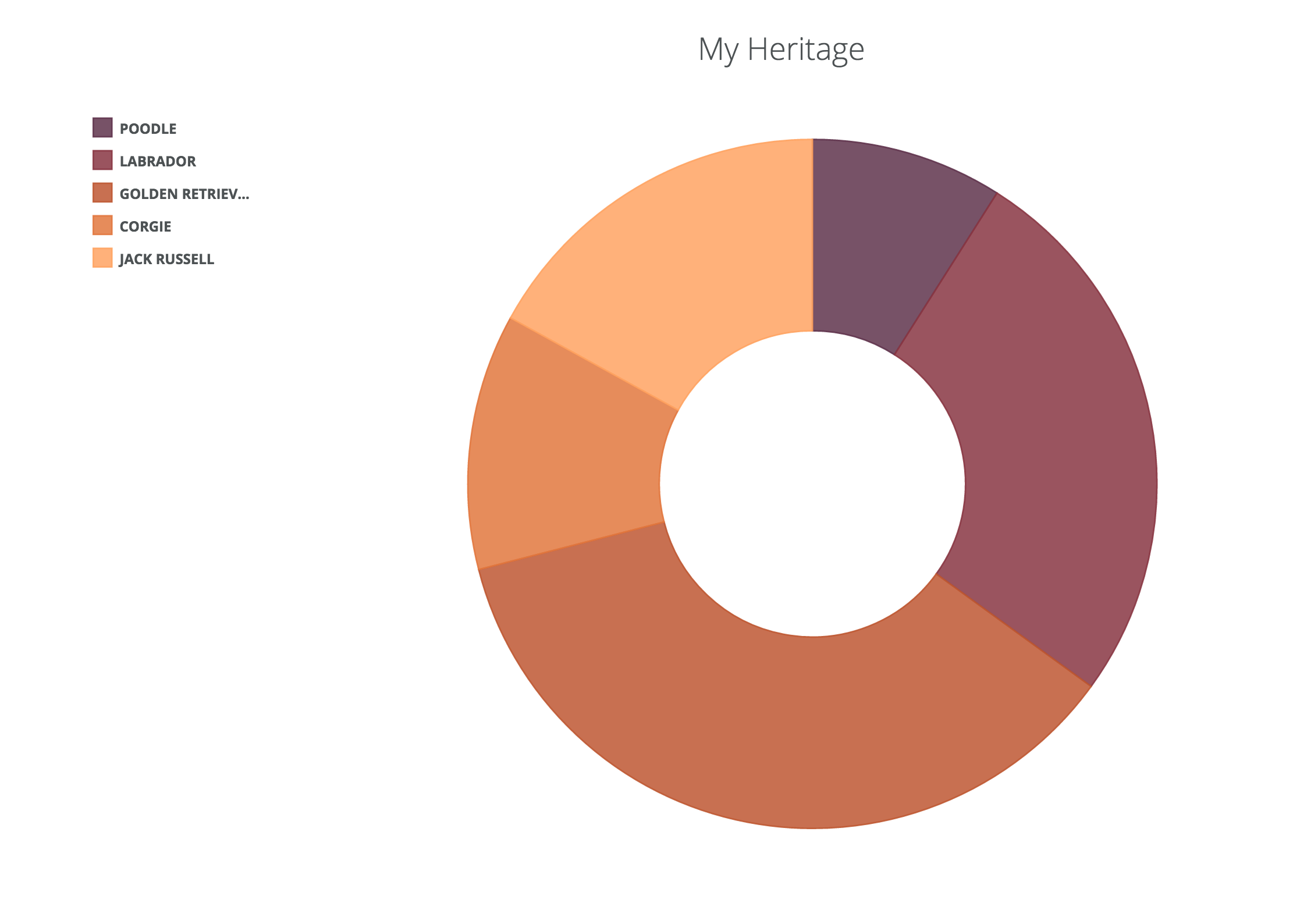 |
Spring is more varied and a brighter more fun palette.
| Nature Image | Palette |
|---|---|
 |
 |
When creating a theme, aesthetics should be considered, but more important is the legibility of the data visualization, which allows for better user engagement. We provide some guides, tips and samples to get your started!
As we mentioned earlier you need to think about color and typography. Both are critical to creating visualizations that tell stories with your data.
For example, for a color palette, it's important to consider how many colors will be used, and to make sure each color is different enough from the others in the palette so that the eye can quickly separate different data representations.
To accomplish this, it's recommended to use colors that vary in hue and brightness slightly. The article by Samantha Zhang does a great job describing how to do this well.
Notice the varying HSV values in the existing color palettes; H representing Hue, S representing saturation, and V brightness.


With any color palette for data visualization it's important to be cognizant of color blindness.
You should test for how your colors look in all types of color blindless lenses, but the most common type of color blindness is Deuteranomaly. For a person with no color-blindness, this is what the palettes look like for someone with Deuteranomaly:

There are generally 2 types of color palettes: Monochromatic // non If creating an all one color palette, start with one base color - either a mid-tone or darkest tone is usually the best - and increase/decrease the hue and brightness accordingly.
For larger data sets it makes sense to use a wider variety of hues, using some variation of each. For example:
- We used www.coolors.co to create 5 color palettes
You can easily import any font-family into your css stylesheet. The most important thing with type is legibility. This means a reasonable font size so users can easily reference the legend and understand what the graph means. In addition, the typography in data visualization should not use any display fonts-- this will be harder to read and distracting from the main purpose-- the visualization.
https://richardbrath.wordpress.com/2015/11/30/font-legibility-and-data-visualization/
Our default Type: ** Open Sans. **
Here are some recommended Google fonts:
Sans Serif:
- Lato
- Libre Franklin
Serif:
- Slabo
- Merriweather
- Droid Serif.
An easy bet that your font will be legible is to use a monospaced type. Typewolf recommends these: https://www.typewolf.com/top-10-monospaced-fonts
Themes should have short names, ideally 1 or 2 words. They need to be all lower-case and separated with dashes like "spring-time" or "fall-harvest".
You will need to set up a directory for your theme inside the base stylesheet inside * plugins > query > themes * If your theme name is "fall-harvest", create a directory inside "themes" named "fall-harvest", and inside insert a duplicate of the base stylesheet that you can find in "themes".
Replace the strokes and fills for each color with the new hex color codes. Add as many colors as you'd like following the naming structure in place (.color-5, .color-6. color-7 and so on.).
For example:
.color-0 {
  stroke: #261e7f;
  fill: #261e7f;
}

.color-1 {
  stroke: #264aa5;
  fill: #264aa5;
}
.color-2 {
  stroke: #277ace;
  fill: #277ace;
}

.color-3 {
  stroke: #2bb3e5;
  fill: #2bb3e5;
}
.color-4 {
  stroke: #37d5fc;
  fill: #37d5fc;
}
We have provided the pre-installed themes as references:
To put your theme to use, you can drag-and-drop your .css file into Slack or add it with the + button manually.

How you name your css file is how you will reference your theme in commands for Fetch. For example, if you name your file, 'fall-harvest.css', your command for a chart will look like this:
!chart MyTable my_column 10 fall-harvest
If you need more information on structuring commands, please see the general readme.